Every email campaign that you send out either goes out with a prayer that it converts or with solid testing with only the people’s choice delivered carefully to their inboxes. So if you wish to optimize your future email campaigns, A/B testing is the way to go.
The success of an email depends on the optimization of all its elements which can be broadly categorized into content, design, and timing elements. While it’s best to test each element separately as it will be easier to pinpoint the reason behind the results, in the text that follows, we will discuss the basics of A/B email testing and delve deep into zeroing in on testing CTAs that resonate best with the target audience.
Table of Contents
What is A/B Testing, and Why Should Email Marketers Go For It?
Split email testing or A/B email testing, call it what you may, the logic is simple. It involves the randomized exposure of two different segments of a mail that is sent out to two different segments of subscribers with two or more versions of a specific element at the same time. The idea is to identify the winning mailer that gets the maximum number of opens and click-throughs; this is the one that will finally get to the rest of the subscriber base.
A version of the mailer includes the original or the control testing variable, whereas B refers to the variation of the variable being tested. When it comes to why marketers should care about running split tests, the reasons are multi-pronged, with gathering knowledge about what works and what does not being the major goal.
Another factor to consider is the winning edge that brands stand to gain over the 39% who choose not to optimize their campaigns using A/B testing. One must also consider the fact that sometimes small wins translate into big achievements in real-time.
For instance, suppose sending out personalized sender names in the From section instead of a generic name results in a minor improvement in open rates and click-throughs; the increase in leads may give your brand that winning edge over competitors who choose not to do that. Better ROIs and optimized email campaigns are what you seek to gain.
Call to Action buttons are the direct point of contact between the subscribers and your brand. When optimized correctly, using A/B testing, you can be sure of sending out an emailer copy that has the winning CTAs and thus know that your efforts won’t go to waste!
Variables To Test For Optimizing CTAs
Your email’s copy, tone, design, and interactive elements definitely attract audiences to read and engage with your message, but it is the efficacy of the CTA button that draws in the moolah. There are a plethora of CTA elements that you can optimize using A/B testing. Let’s check them out.
Text vs. Button:
Some people like to click away, while some prefer a smooth-flowing conversational email with no breaks such as buttons. You can run split email tests experimenting with what kind of CTA your audiences are most likely to engage with.
Color
Colors have a distinct effect on buyer psychology with a subconscious associative effect on the viewers. For instance, the use of warm colors in the CTA button, such as orange and yellow, is known to generate feelings of optimism in the prospective buyer. While green symbolizes freshness, cold colors such as blue symbolize confidence and serenity.
You can choose to get creative and experiment with the CTA button and email color contrast to make the CTA text/button stand out. However, it would be recommended to play it safe and cool within the boundaries of the brand’s color palette. A poor choice of colors may prove counterproductive.
The Wording of the CTA Copy
The whole idea behind the phrase on the CTA is to let readers know what lies next and to get them to engage with the landing page and finally convert. You might like to get creative and experiment with the CTA copy, however, not at the cost of losing out on the clarity of the message.
You could hypothetically test out two differently worded copies yet let the subscriber know what to expect and give them a peek into the destination they are headed to.
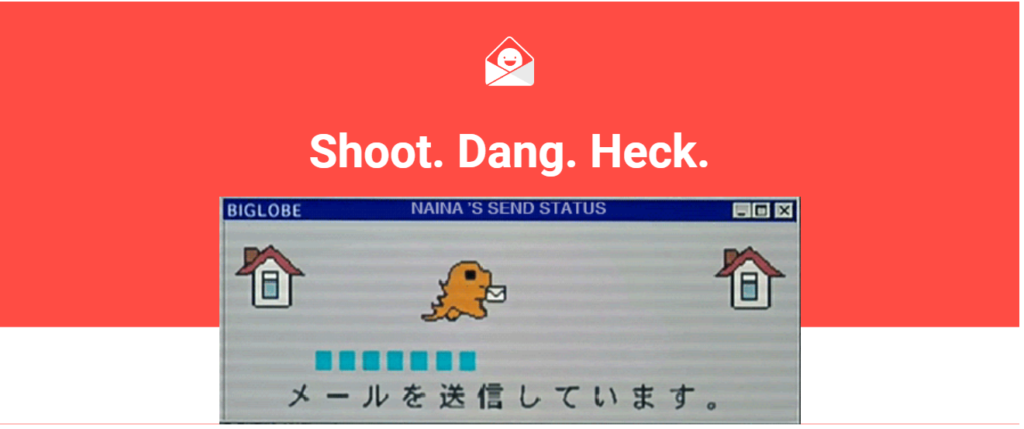
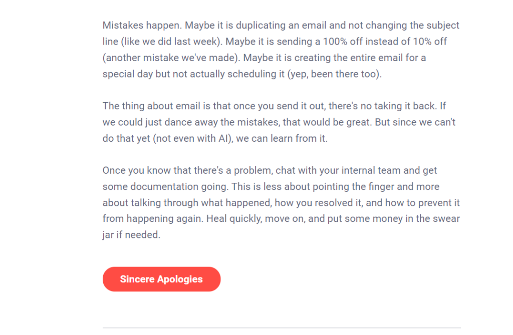

The above apology email from RGE made it to my inbox, and it’s as if the universe is tuning in to my need for examples of creative CTA copies that are awesome and do the job!
Everything about the CTA, right from the color to the copy and rounded edges of the button, got me curious enough to engage with the email. I was redirected to the “Sorry, Charlie” email collection, and I couldn’t be more thrilled with the brains at work in the RGE team. You get the drift!
The voice of the message is another element of the CTA copy that you could consider experimenting with. For example, instead of “Buy Now!” you could try testing the audience’s receptivity to something a little more offbeat, say, “Gimme mine!”, for instance.
CTA Placement
The placement of the Call to Action in the email copy is extremely significant. It can make or mar your campaign’s success. You could try creating A and B copies wherein the placement of the CTA varies.
In the control version, you could try placing the CTA above the fold, wherein the user doesn’t have to scroll to the bottom of the email to know what needs to be done. While in the B version, you could sprinkle the CTA between the email copy and then compare the click-through rates of both versions.
Size of the Button
When you want to make your email accessible to all segments of your audience, you would go that extra mile to create buttons that are responsive across a myriad range of screens right from mobiles to desktops as well as compatible with assistive technologies such as screen readers.
One could try testing different sizes of buttons and renderability on screens. Go with the one that audiences respond best to! The idea is to make buttons that are large enough to stand out and easy to click for all users across the spectrum.
Playing with Special Effects
In order to make the CTA button stand out, you could try experimenting with different special effects on the button. Try sending out different test runs of email versions containing shadow, 3D effects, or micro interactivity.
Examples Of Emails With Awesome CTAs
Now that we are familiar with the different elements of CTAs that you can consider running split email tests on, let’s check out instances of brands with really good email CTAs!


Source
This winner from Hulu plays it cool with multiple CTAs that are relevantly worded and placed at specific portions of the email copy. The message and the intent are crystal clear, with zilch room for doubt and second guesses. The black-and-white color contrast adds to the readability of the CTA text.


Source
This one from 8 AM Creative nails it with the witty CTA copy because, hey! Everyone loves free stuff! Also, the color contrast and the rounded edges on the CTA button are on point. We’d totally click; run tests to see if your audience would too!
Summary
To achieve meaningful and credible results, it is of highly important that you subject your CTAs to rigorous A/B testing, utilizing the insights obtained to continuously optimize them in your campaigns.
If you seek professional help in creating pixel-perfect email campaigns from scratch, running A/B tests, and, ultimately help you realize those crazy ROIs, Email Uplers is all ears! We’d love to hear your ideas and turn them into premium deliverables. Hit us up now!


